Show Grid
icono archivo
Sin Título-1

Cargando...

work 1
work 2
work 4
work 5
work 7
work 8
work 9
work 10
work 11
work 12
work 13
work 14
work 15
work 16
work 19
work 20
work 21
work 22
work 23

Cuerno: The typographic design transfers the logic of the croissant’s folding and baking process into the graphic plane. Each brand message activates this visual metaphor, reinforcing the connection between product and identity. Escribà: The visual system is born from the essential: the raw material. A synthesis of the natural and the digital, expressed through cacao pixels. Puccias-02: From the Cinematic Universe to Everyday Life in Madrid: a Project that Connects Visual Narrative, Iconic Materials, and User Experience D-Generades: From the intersection of fashion and masculinities, a critical reflection that turns tension and dissent into graphic tools to question established cultural and gender codes. Novus: The naming concept is projected into the visual identity, creating a visual ecosystem that stems from the exploration of traditional objects and symbols of the sector, reinterpreted through contemporary codes.

work 25
work 26
work 28
work 29
work 30
work 31
work 32
work 33
work 34
work 35
work 36
work 37
work 38
work 39
work 40
work 43
work 44
work 45
work 46
work 47
work 48
work 50
work 51
work 52
work 53
work 54
work 55
work 56
work 57
work 58
work 59
work 60
work 61
work 62
work 64
work 65
work 67
work 69
work 70
work 71
Cursor ilustrado de Sin Título-1
Xabier Isasti
Cursor ilustrado de Sin Título-1
Xabier Isasti
Novus 2/2
Editorial design
Novus 2/2 thumbnail
Joan Escribà
Visual Identity & Packaging
Joan Escribà thumbnail
Novus 1/2
Visual Identity
Novus 1/2 thumbnail
Hasta el cuerno
Experimental type design
Hasta el cuerno thumbnail
D-generades
Graphic campaign
D-generades thumbnail
Sustainable challenge
Graphic Campaign
Sustainable challenge thumbnail
Puccias-02
Branding & Interior design
Puccias-02 thumbnail
Harroby
Graphic campaign
Harroby thumbnail
Novus 2/2
Editorial design
Novus 2/2 thumbnail
Joan Escribà
Visual Identity & Packaging
Joan Escribà thumbnail
Novus 1/2
Visual Identity
Novus 1/2 thumbnail
Hasta el cuerno
Experimental type design
Hasta el cuerno thumbnail
D-generades
Graphic campaign
D-generades thumbnail
Puccias-02
Branding & Interior design
Puccias-02 thumbnail
Harroby
Graphic campaign
Harroby thumbnail
A full-service design studio based in Barcelona, working worldwide.
D-generades

D-generades

Break established patterns.

2025BarcelonaGraphic campaign

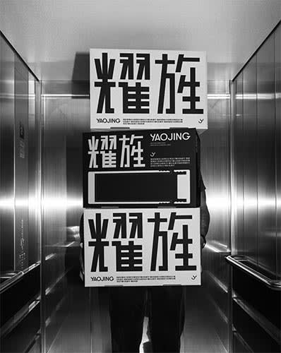
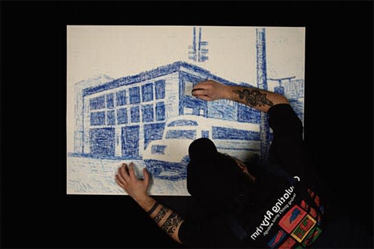
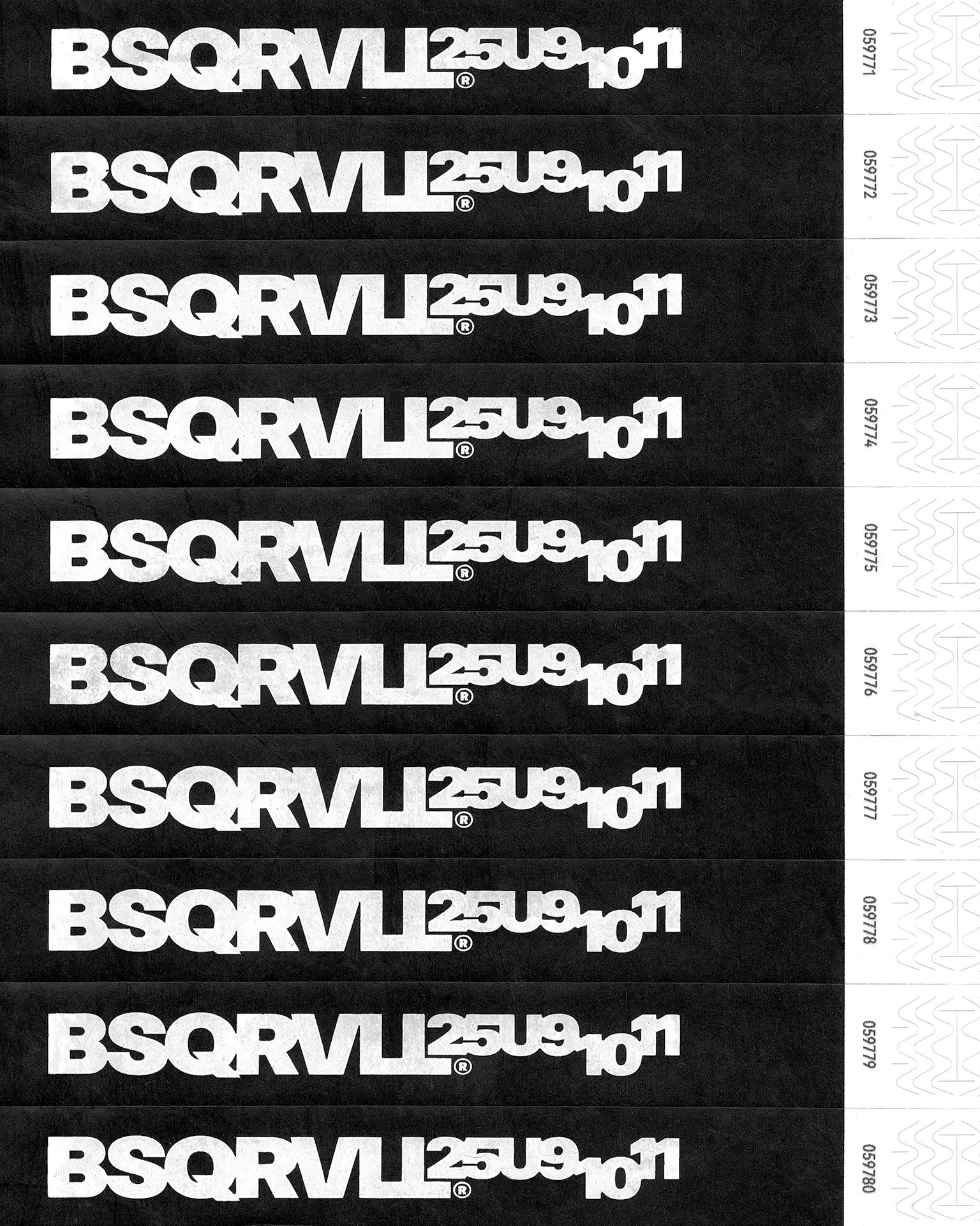
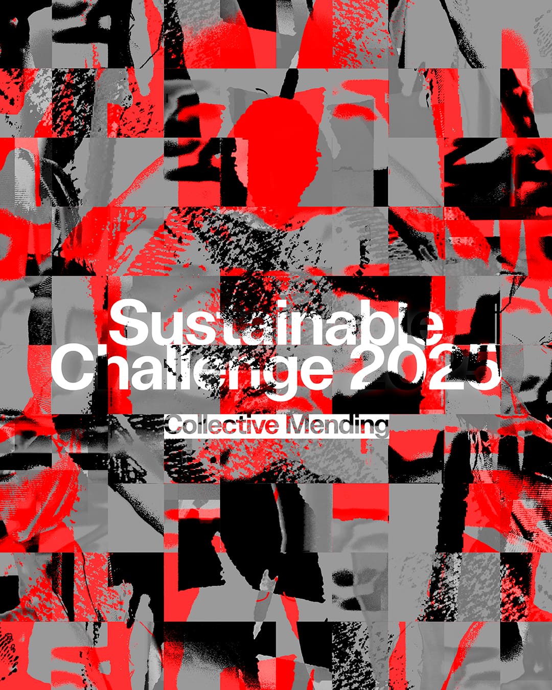
D-Generades is an annual project promoted by the Barcelona Design Hub that, in each edition, proposes a critical reflection on the connections between design and society. In 2025, the theme focuses on the dialogue between fashion and masculinities, questioning the cultural and aesthetic codes that have historically defined gender representations. The graphic proposal for this edition articulates a visual discourse that explores the friction generated when dominant cultural systems are destabilized, revealing both collective discomfort and symbolic resistance to what is new and disruptive. On a conceptual level, the campaign works with the notion of semiotic tension: a confrontation between traditional legibility and the construction of a visual language that challenges the spectator’s passive gaze. In this way, the graphic system is not limited to communicating a message but demands a degree of active participation, requiring the decoding and reconfiguration of habitual perceptual structures. In formal terms, the typographic strategy focuses on the rupture of linearity and the alteration of reading hierarchies. The design unfolds through a dual plane of interaction: MACRO PERCEPTION, in which the title and central concept emerge as dominant elements, allowing an immediate understanding of the theme. MICRO PERCEPTION, where fragmentation and intentional disorder generate a space for exploration, requiring attention, effort, and visual engagement to access the complete content. The result is a campaign that transforms discomfort into an aesthetic tool, using dissonance as a critical resource and proposing a graphic language that not only communicates but also performs the experience of questioning what is established.

Client
Barcelona Design Hub

Sector
Culture

Icono de cursor
Ana C.
Icono de cursor
Xabier I.

Credits


Creative direction & design Xabier Isasti
Motion graphic Ana Collantes
Event Photo Pep Herrero