Show Grid
icono archivo
Sin Título-1

Cargando...

work 1
work 2
work 3
work 4
work 5
work 7
work 8

Cuerno: The typographic design transfers the logic of the croissant’s folding and baking process into the graphic plane. Each brand message activates this visual metaphor, reinforcing the connection between product and identity. Escribà: The visual system is born from the essential: the raw material. A synthesis of the natural and the digital, expressed through cacao pixels. Puccias-02: From the Cinematic Universe to Everyday Life in Madrid: a Project that Connects Visual Narrative, Iconic Materials, and User Experience D-Generades: From the intersection of fashion and masculinities, a critical reflection that turns tension and dissent into graphic tools to question established cultural and gender codes. Novus: The naming concept is projected into the visual identity, creating a visual ecosystem that stems from the exploration of traditional objects and symbols of the sector, reinterpreted through contemporary codes.

work 13
work 14
work 15
work 16
work 17
work 18
work 19
work 20
work 22
work 23
work 24
work 25
work 27
work 28
work 29
work 31
work 32
work 33
work 34
work 36
work 37
work 38
work 39
work 40
work 41
work 42
work 43
work 44
work 45
work 46
work 47
work 49
work 50
work 51
work 52
work 53
work 54
work 56
work 57
work 58
work 59
work 60
work 61
work 62
work 63
work 64
work 65
work 66
work 68
work 69
work 70
work 71
Cursor ilustrado de Sin Título-1
Xabier Isasti
Cursor ilustrado de Sin Título-1
Xabier Isasti
Novus 2/2
Editorial design
Novus 2/2 thumbnail
Joan Escribà
Visual Identity & Packaging
Joan Escribà thumbnail
Novus 1/2
Visual Identity
Novus 1/2 thumbnail
Hasta el cuerno
Experimental type design
Hasta el cuerno thumbnail
D-generades
Graphic campaign
D-generades thumbnail
Sustainable challenge
Graphic Campaign
Sustainable challenge thumbnail
Puccias-02
Branding & Interior design
Puccias-02 thumbnail
Harroby
Graphic campaign
Harroby thumbnail
Novus 2/2
Editorial design
Novus 2/2 thumbnail
Joan Escribà
Visual Identity & Packaging
Joan Escribà thumbnail
Novus 1/2
Visual Identity
Novus 1/2 thumbnail
Hasta el cuerno
Experimental type design
Hasta el cuerno thumbnail
D-generades
Graphic campaign
D-generades thumbnail
Puccias-02
Branding & Interior design
Puccias-02 thumbnail
Harroby
Graphic campaign
Harroby thumbnail
A full-service design studio based in Barcelona, working worldwide.
Novus 2/2

Novus 2/2

The Newspaper as a Brand Manual.

2024BarcelonaEditorial design

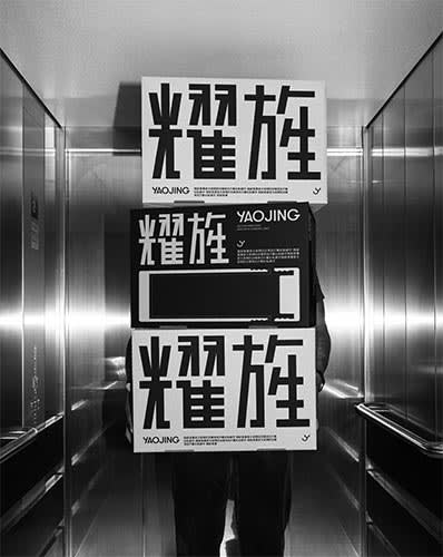
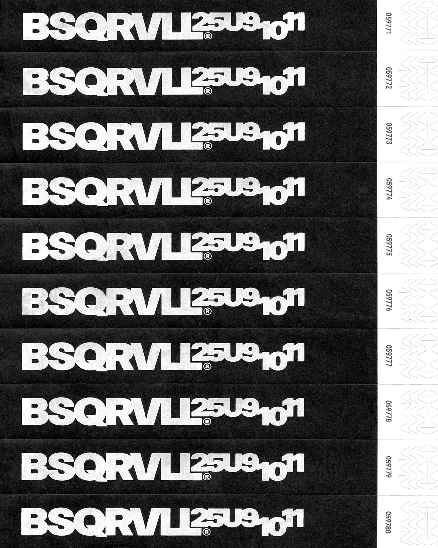
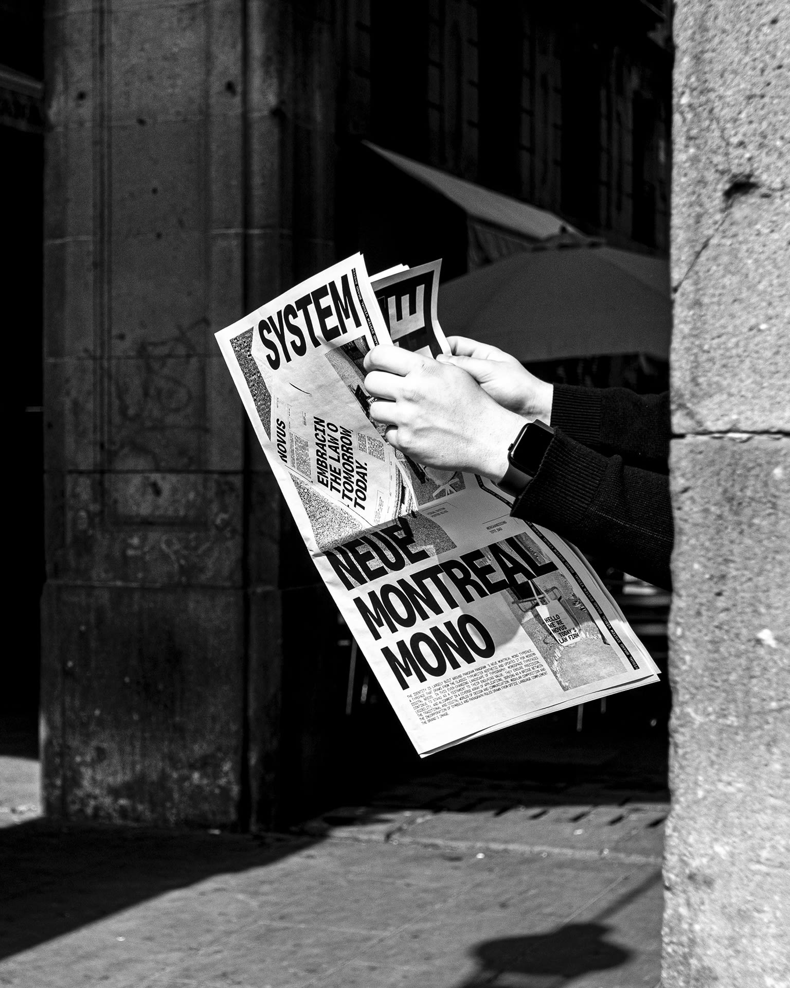
The Novus brand book is realized as an editorial publication in newspaper format, complemented by a refurbished 1952 corporate briefcase, which serves as both a container and a conceptual support for the project. This choice not only references the documentary tradition of the legal field, but also reinterprets historical elements in a contemporary context, reinforcing the conceptual paradox that underpins the brand’s identity: the old becomes new. A photographic art direction in high-contrast black and white was developed, evoking the aesthetic of a contemporary era; however, the elements within the composition, such as the newspaper and briefcase, introduce a bygone dimension, creating a visual dialogue between tradition and innovation. The newspaper includes 4 fold-out sheets that transform into posters, presenting the brand identity in a visual and strategic manner and articulating its graphic elements and corporate narrative. The newspaper format allows for a sequenced and open reading, while the 1952 briefcase creates a tangible link to the history of the legal environment. Together, these physical resources transform the object into a narrative container that communicates Novus’ identity beyond digital and printed media.

Client
Novus

Sector
Legal

Icono de cursor
Jorge O.
Icono de cursor
Cristina B.
Icono de cursor
Xabier I.

Credits


Art direction, brand identity & editorial design Xabier Isasti
Creative copywriting Cristina Blanc
Photo Jorge Ossa
Model Juan Sesma