


Novus 1/2
Today’s law firm.
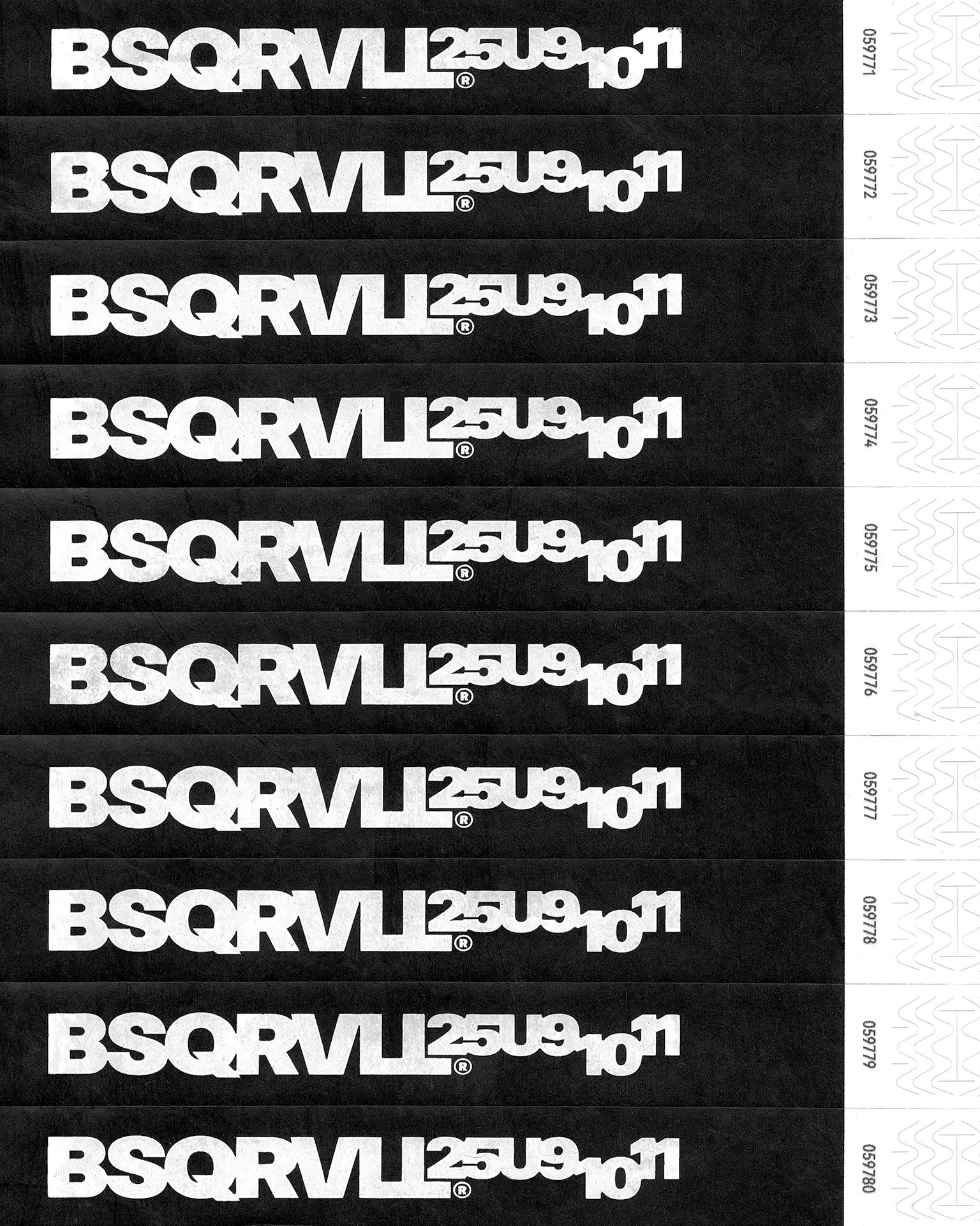
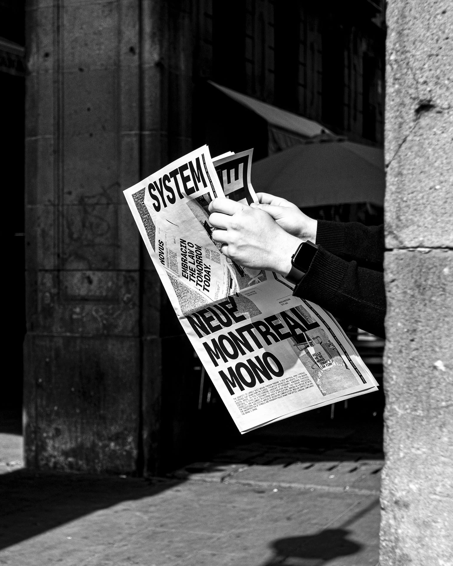
Novus was created as a law firm aiming to challenge the traditional codes of the sector, projecting an ethical, transparent, and innovative image aligned with 21st-century society. Its name comes from Latin, one of Europe’s oldest languages, yet it means “New.” This paradox is reflected in the visual identity: just as the name takes something ancient and gives it a contemporary meaning, the design recovers traditional objects, elements, and visual supports from the legal field and reinterprets them in a modern graphic language. The typographic system is centered on Neue Montreal Mono by @pangram.pangram, a family rooted in the aesthetic of classic typewriters but updated for contemporary digital environments. The monospace typeface provides precision, legibility, and consistency, functioning as a bridge between the historical memory of the sector and current graphic needs. The identity is structured through a modular system, incorporating symbols, paragraph rules, and other graphic elements inspired by office iconography and visual language. This framework allows flexibility and coherence across applications, from corporate documents to digital platforms, ensuring a clear and recognizable visual communication. The result is a visual system that translates Novus’ values into a contemporary graphic experience, balancing tradition and modernity while projecting a distinctive personality within the legal world.
Client
Novus
Sector
Legal

Marc S.
Xabier I.
Cristina B.
Credits
Art direction & graphic design Xabier Isasti
Creative direction Marc Sánchez
Strategy Marc Sánchez & Anais Rubio
Naming Javi Ribas
Creative copywriting Cristina Blanc
Motion graphics Nacho Tabuenca
Featured
2025 Contemporary Type
2025 Grafik Feed
2025 Noonstead